ShopDreamUp AI ArtDreamUp
Deviation Actions

HG Designs Subscriber Area
Lots of high resolution goodies for graphic design including textures, photoshop brushes, seamless patterns and more.
$8/month


Suggested Deviants


Suggested Collections


You Might Like…


Featured in Groups


Description
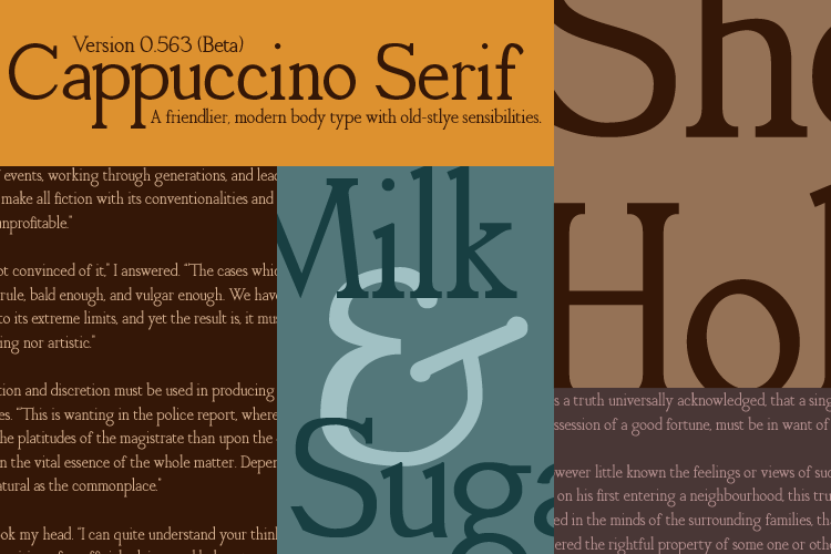
Cappuccino Serif 0.563
There are way too many things to talk about in this box, so I will try to limit it to relevant-ish things.
You are free to use this typeface for non-commercial purposes. I suppose you can modify if you'd like, but if you do I'd really appreciate you asking permission before you publish it, etc.
Why beta?
Well, this one is actually pretty well kerned, though it's a bit tight for small point sizes. It is missing a few things though:
^{}*%#~ and all the assorted other accents. Also non typographer's quotes. I'm working on them, I swear, but I can never get them to look good. Also missing: italic and bold fonts. They are being sketched, but I'm somewhat sick of this typeface at this point and don't feel like staring at all my mistakes. Also there are mistakes. Not real mistakes, but like I'm really a crazy person who really wants something to look a certain way, but it's slightly off but not off enough to actually merit messing everything up; so I deal with it.
Format:
Opentype PS (Type 1)
Both Mac and PC compatible.
Expected update:
I'm going to fill in some of the gaps (most notably I want to take care of accents). I'm sick of working on it at the moment, but I'm going to say I'll update around the 14th or so for those who need the extra characters and junk.
**Edit 1/4/2011
Realized I really had no reason to zip the thing, so now it's just the otf download. Nothing major.
**Edit 1/24/2011
Major revision time. A whole bunch of characters got edited, kerning changed, things added, and more. First, totally reworked a couple characters I didn't like, and a whole bunch of minor changes to others. Second, I added some basic accents (acute and grave) and a sweet Th ligature. Third, some kerning edits to make it have better flow. The big thing here is that I think this represents the end of the major revisions to the letter-forms, now onto bigger and better things.
A big thank you to all of those who have stopped by, and definitely to those who gave a
 . Your support has made a big difference and is what drives me to keep at this.
There are way too many things to talk about in this box, so I will try to limit it to relevant-ish things.
You are free to use this typeface for non-commercial purposes. I suppose you can modify if you'd like, but if you do I'd really appreciate you asking permission before you publish it, etc.
Why beta?
Well, this one is actually pretty well kerned, though it's a bit tight for small point sizes. It is missing a few things though:
^{}*%#~ and all the assorted other accents. Also non typographer's quotes. I'm working on them, I swear, but I can never get them to look good. Also missing: italic and bold fonts. They are being sketched, but I'm somewhat sick of this typeface at this point and don't feel like staring at all my mistakes. Also there are mistakes. Not real mistakes, but like I'm really a crazy person who really wants something to look a certain way, but it's slightly off but not off enough to actually merit messing everything up; so I deal with it.
Format:
Opentype PS (Type 1)
Both Mac and PC compatible.
Expected update:
I'm going to fill in some of the gaps (most notably I want to take care of accents). I'm sick of working on it at the moment, but I'm going to say I'll update around the 14th or so for those who need the extra characters and junk.
**Edit 1/4/2011
Realized I really had no reason to zip the thing, so now it's just the otf download. Nothing major.
**Edit 1/24/2011
Major revision time. A whole bunch of characters got edited, kerning changed, things added, and more. First, totally reworked a couple characters I didn't like, and a whole bunch of minor changes to others. Second, I added some basic accents (acute and grave) and a sweet Th ligature. Third, some kerning edits to make it have better flow. The big thing here is that I think this represents the end of the major revisions to the letter-forms, now onto bigger and better things.
A big thank you to all of those who have stopped by, and definitely to those who gave a
Comments48
Join the community to add your comment. Already a deviant? Log In
Cool